B4 Formats for Decision Making
Create and interpret graphs using spreadsheets
line
pie
bar charts
histograms.
Scatter Graphs and Linear Line Trends
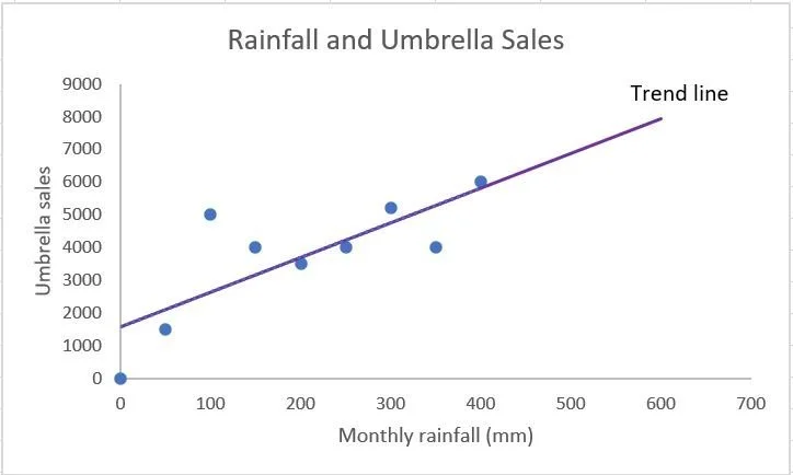
Scatter (XY) graphs can be used to display two sets of data to see if there is a correlation between them.
When both variables increase, there is a positive correlation. An example of positive correlation could be rainfall and umbrella sales. When one variable increases and the other decreases, this is a negative correlation. An example of negative correlation could be rainfall and ice cream sales. When no relationship can be found between the two variables, there is no correlation.
A trend line can be drawn though the centre of the points to make the graph easier to interpret. This line can be extrapolated to predict future trends.
